Rebrand & Packaging
Rocks N’ Rolls
Personal project for: St. AmourBakery.
Role: Graphic Designer | Art Director
St. Amour Bakery has been producing high-quality cookies and granola for individuals with specific health needs for over 25 years. Their commitment to producing delectable and nutritious products has been the cornerstone of their success, with their products being sold in supermarkets across California, as well as the East Coast.
During a recent grocery shopping trip, I came across one of their standout products, Rocks N’ Rolls, and was inspired to work on refreshing the brand to match the incredible taste of these vegan cookies.

Enhancements to the current packaging:
Lack of information hierarchy: The packaging currently lacks a clear hierarchy of information, making it difficult for consumers to quickly understand the key details.
Poor visibility of flavors: One of the main issues with the current packaging is that it doesn't allow consumers to easily identify the flavors without closely examining the product.
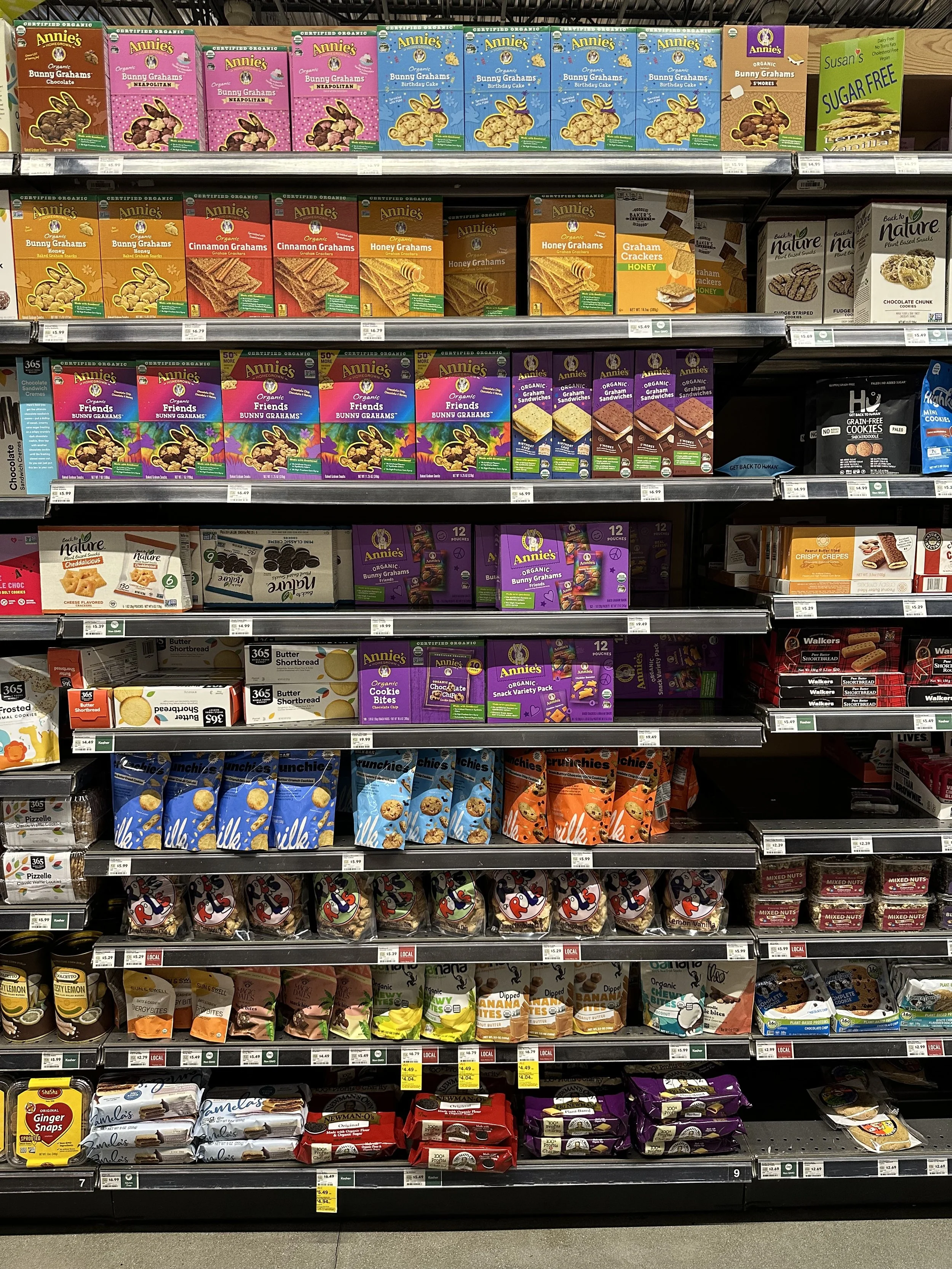
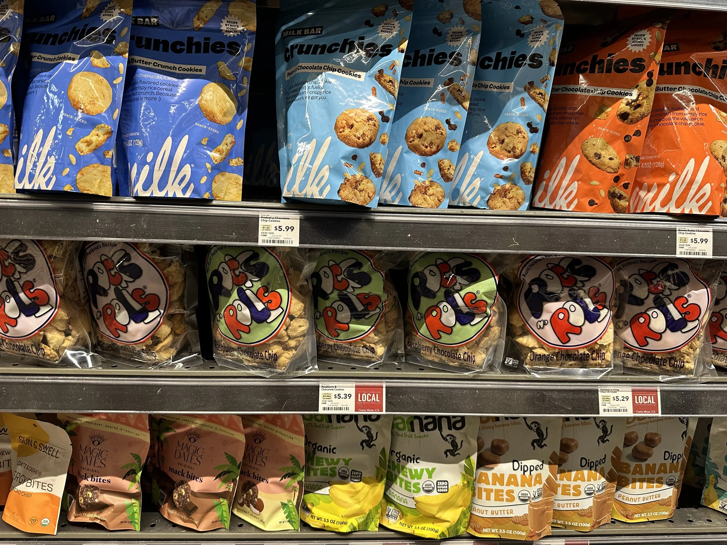
Lack of visibility on store shelves: The current packaging design fails to stand out among the competition on store shelves.

Packaging Components
In order to design the packaging for Rocks N’ Rolls effectively, it was essential to consider all the necessary components beforehand. This involved studying the current strategies employed by competitors and analyzing how they communicate through their packaging.

Competitive Landscape
Additionally, I conducted a brief competitor analysis to assess both the label design and pricing strategies of other brands. This analysis allows to position the Rocks N’ Rolls brand within a broader context, enabling me to identify opportunities to differentiate and create a unique selling proposition.

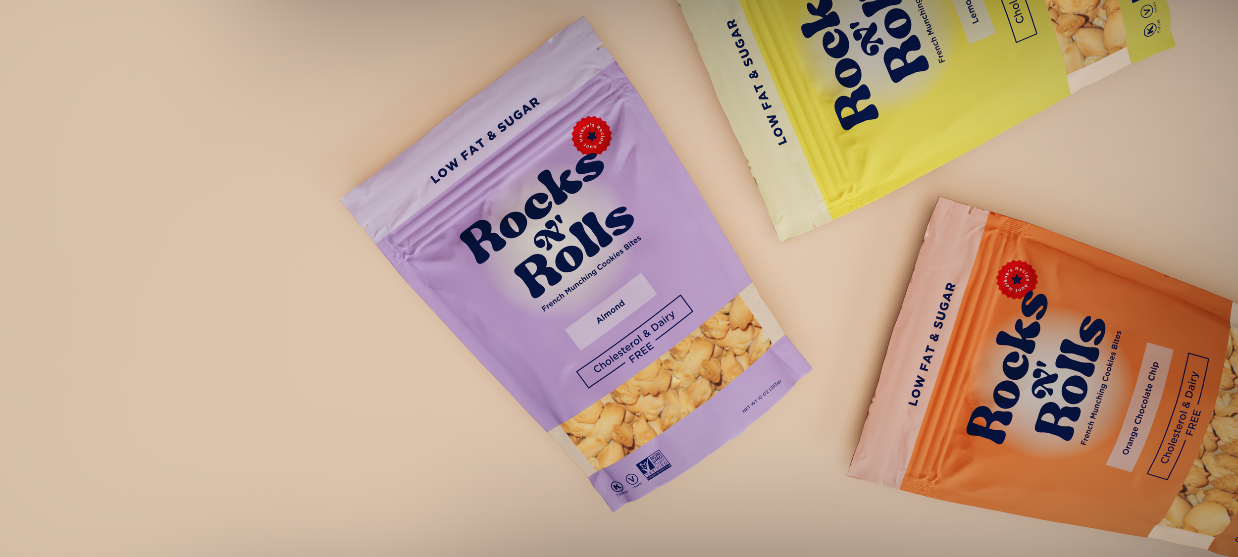
The updated Rocks N’ Rolls brand identity was inspired by Daniel's French background and his desire to create a cookie that not only represents his culture and family but is also healthy and made with care. The logo's colors kept reflecting both his French roots and the American flag. The revamped identity stays true to the values of St. Amour Bakery, emphasizing its hand-crafted products and making the brand more approachable and memorable in the market.
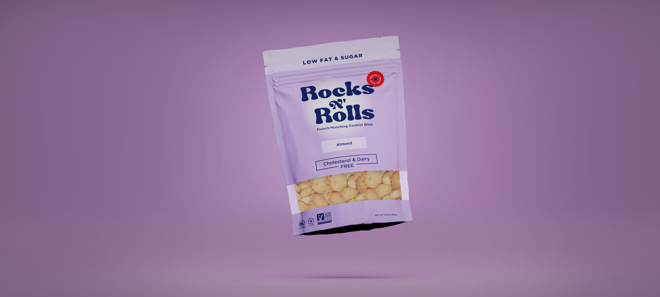
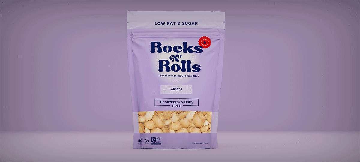

To ensure the flavors of the cookies were highlighted, I developed a color-coded system to differentiate each flavor and emphasized the labeling hierarchy. This approach not only improves the visual appeal of the packaging but also enables customers to easily identify their preferred flavor. The resealable standing pouch bag has a clear window that allows customers to appreciate the quality of the product.